Adding themes to the app: approaches and analysis

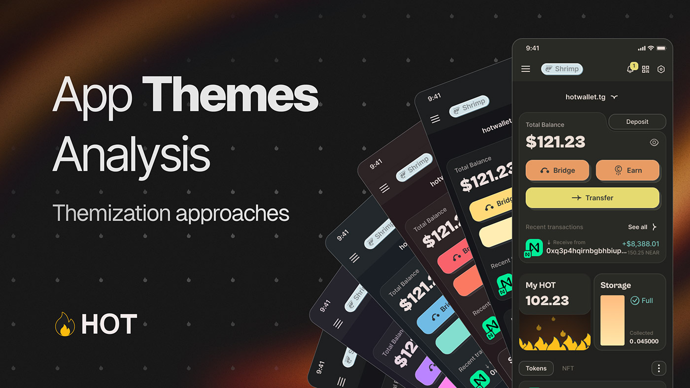
We recently released an update with dark theme support, and today we're going to discuss how themization works technically. There are two approaches to themization: «non-scalable and fast» and «scalable and long»
Non-scalable approach
The first approach implies that, taking the initial UI, we create several screens with dark theme references. We then form a new UI kit and start manually changing components (buttons, text, separators, and more) to the new palette. Despite the seeming abundance of work, this takes 1-2 days for a junior or mid-level frontend developer. However, this method leads to a lot of bugs and is not scalable. When adding a new palette, you will have to manually prescribe colors for each element, which is inefficient.
Scalable approach using design tokens
The problems of the first approach are solved by using design tokens. In simple words, a token is the color of a specific element in a specific place and a specific theme. For example, a token for the main text in a light theme would be called light-text--primary. The token contains a specific color within it.
By applying this to all elements (text, icons, controls, borders, etc.), we can create a table where the row header is the token name and the column header is the theme. The cells in such a table will result in the HEX codes of the colors.
Advantages of using tokens
What does it give us? By assigning tokens to all components in the light theme, we can easily change the value of the theme in the token name, starting to take new values from the table. So by spending 1-3 days assigning all tokens or using them from the beginning, we can add new topics in just 15 minutes.
The process is done as follows:
- A new column is created and a new color is added in each row against the use case.
- The new table is uploaded as a JSON file directly to GitHub.
- The developer adds a new field for the new theme and in just a couple of clicks, the entire application is recolored.
If done correctly, there's no need to even double-check: all the colors will end up in their proper places.
Popularity of design tokens
Design tokens became popular not so long ago. Google's Material Design is a prime example of their use. Documentation is available at the link: Metarial Design.
Customization and theme change screen
I'll briefly touch on the customization and theme change screen. In most apps, changing the theme is often treated as a one-size-fits-all solution, such as via a toggle or selecting from a list. Rarely do developers do a small illustration sketching the interface in dark and light. This approach did not satisfy us.
One of HOT's core UI values at the moment is this: if we can do something better minimally affecting the development process and we have the opportunity to do a few more iterations, we do it. This approach allows us to increase brand recognition and stand out visually from the competition.
On average, 50% of users change the design theme during the life of a project. In our case, that's millions of people who will visit this page. So why not make it visually creative and memorable? 👀
The theme change page in HOT Wallet has a unique animation that we arrived at through several iterations. Originally it was just a sun and moon. Then we added a forest and a window frame, which harmonize perfectly with our interface thanks to strict lines and hard shadows, creating a whole picture.
In this way, approaches to theming can greatly influence the user experience and the overall design of an app. Stay tuned for the next updates!


